Weekly Market Outlook – The Market’s Got the Coronavirus Blues
Weekly Market Outlook – February 23rd, 2020
We’ll start this week’s analysis out with the very most important, and troubling, chart… the daily chart of the S&P 500. On this graph we can see the full scope of the selloff. The index struggled for days to move higher, but when that clearly wasn’t going to happen, it didn’t take much to pull the rug out from underneath the market. Also notice how much volume surfaced with Thursday’s and Friday’s selloff. It’s alarming because it didn’t surge. Rather, volume just drifted higher, suggesting it wasn’t knee-jerk, panic selling.
S&P 500 Daily Chart, with VIX and Volume
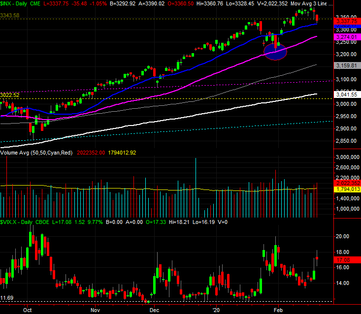
Source: TradeStation
It’s not necessarily the end of the world. Notice that while the S&P 500 lost 1.2% of its value last week, it’s not yet fallen below its 20-day moving average line (blue). Until that floor breaks, we can chalk up last week’s weakness to just a little volatility. Also notice that even if the 20-day moving average line breaks, the 50-day moving average line (purple) is serving as a technical floor. The rally since October has been incredible, leaving behind lots of wiggle room. Don’t jump to any conclusions here.
Still, it would be naive to ignore the prospects for a bigger selloff, particularly given what becomes evident with a look at the weekly chart. Take a look. Specifically, take a look at the fact that the VIX has pushed its way back above the falling resistance line that’s guided it lower for well over a year now. Also notice just how far the S&P 500 itself has climbed since the December-2018 low. It’s ripe for a correction, and the VIX is slowly but surely hinting at a change in the market’s underpinnings. Investors are starting to think a little more defensively, which means they may start to act defensively — by selling stocks — in the near future. They just need a little more of a nudge than they’ve gotten thus far.
S&P 500 Weekly Chart, with VIX and Volume
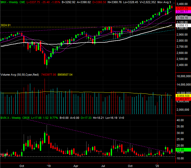
Source: TradeStation
There’s a reason we’re looking for more fundamental changes in the way traders are thinking too… and it’s not the market’s fundamentals. It’s the psychology traders are presently demonstrating. Between October and early this month, traders didn’t bat an eye at clear risks. That optimism carried stocks to record highs, but investors may have gotten a bit arrogant, and are now starting to see the danger of their follow.
There’s a way to quantify that qualitative assessment. The marketwide put/call ratio indicates the bets and hedges the so-called “smart money” and sophisticated traders are making. Thing is, they’re not as smart as they think they are. When the put/call ratio reaches a level that’s unusually low, it’s often a sign that the market is peaking and setting up for a sizeable correction.
The image below compares the S&P 500 to the put/call ratio… a ratio that ran into multi-year lows again this month. The moving average line that plots the trend of the daily put/call data hit 0.73 as of Friday. Notice that corrections have taken shape after the put/call measure has fallen to higher levels than that. But, even so, the low put/call reading of around 0.73 in early 2018 led to a sizable stumble.
S&P 500 Daily Chart, with Put/Call Ratio and Trend
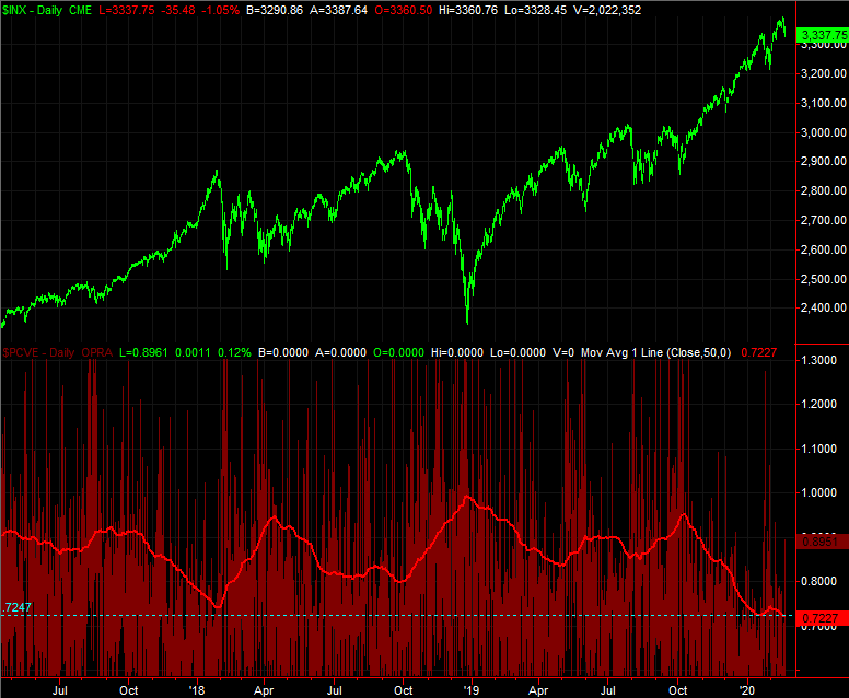
Source: TradeStation
It’s just a possibility, mind you, but a possibility that aligns with the other red flags waving at this time. The 40% gain from the December-2018 low was plenty of fun, but not quite merited. Ditto for the 17% advance just since October’s low.
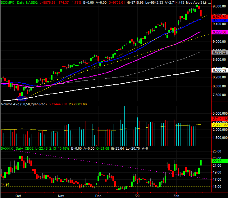
The chart of the NASDAQ illustrates the same vulnerabilities, by the way, and perhaps even more so than the S&P 500’s does. Namely, the NASDAQ’s volatility index (VXN) closed at its highest weekly close since the third quarter of last year. And, the NASDAQ Composite itself dished out a combination of an “inside day” reversal bar last week that also looks like a shooting star or “tweezers.” In more familiar terms, they appear to be an upside down hammer, which often indicate pivot points.
NASDAQ Composite Weekly Chart, with VXN and Volume
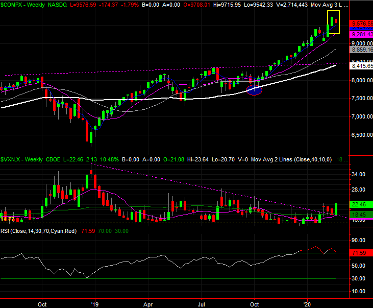
Source: TradeStation
Still, the NASDAQ has the same thing going on the S&P 500 does. That is, the daily chart of the NASDAQ Composite is still finding technical support at its 20-day moving average line (blue). Until it fails to hold up as support, we can’t assume anything. In fact, the NASDAQ has a couple of major floors that could stop a selloff just under the 20-day moving average line as well.
NASDAQ Composite Daily Chart, with VXN and Volume
Source: TradeStation
This week is going to be big one for the market, as it faces its first real test in a while. Just bear in mind stocks could push up and off their collective 20-day moving average lines just a bit bef