Weekly Market Outlook – A Flimsy Gain is Still a Gain
Weekly Market Outlook – February 16th, 2020
We’ll start this week’s analysis with a look at the weekly chart, mostly to show you how big last week’s jump was following the previous week’s jump. The S&P 500’s gain of 1.57% last week after the prior week’s 3.1% advance is impressive, but also unusual. The index is back into the same overbought situation it was in a month ago, up 44% since the December-2018 low.
S&P 500 Weekly Chart, with VIX and Volume
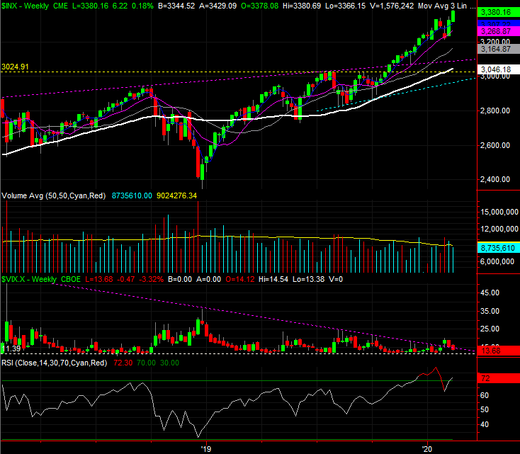
Source: TradeStation
The weekly chart shows us a couple of other important details as well. Namely, we can see that volume continues to fade the higher the market travels, and we can see the VIX has fallen back below the technical ceiling that had been driving it lows for months now. That’s technically bullish (the VIX part), but it also opens the door to a pullback. Sometimes the bears have to punch the bulls in the nose a couple of times to turn the tide. If the VIX moves above its technical ceiling — plotted in purple — a second time and the S&P 500 falls back below its 50-day moving average line (also purple), that could be enough to start the correction that’s now well overdue.
Zooming into the daily chart fleshes out some of the details of where we’ve been, and what’s likely to lie ahead. Specifically, we can see just how big of a deal the S&P 500’s 50-day moving average line is, and we can see just how disinterested the buyers are… as suggested by low and thinning volume.
S&P 500 Daily Chart, with VIX and Volume
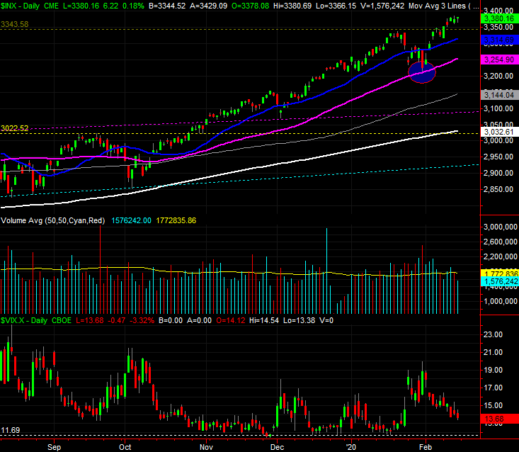
Source: TradeStation
That’s not a judgment call either. The chart below compares the NYSE’s bullish volume (green) to its bearish volume (red), with the S&P 500 at the bottom. Stocks were up on Friday, but there was more selling volume than buying volume. Even without Friday’s oddity, however, there’s been more bearish volume for weeks, relative to bullish volume.
NYSE Daily Bullish, Bearish Volume vs. S&P 500
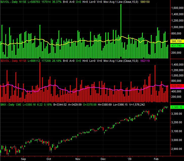
Source: TradeStation
Ditto for the NASDAQ’s bullish and bearish volume, though arguably more so.
NASDAQ Daily Bullish, Bearish Volume vs. NASDAQ Composite
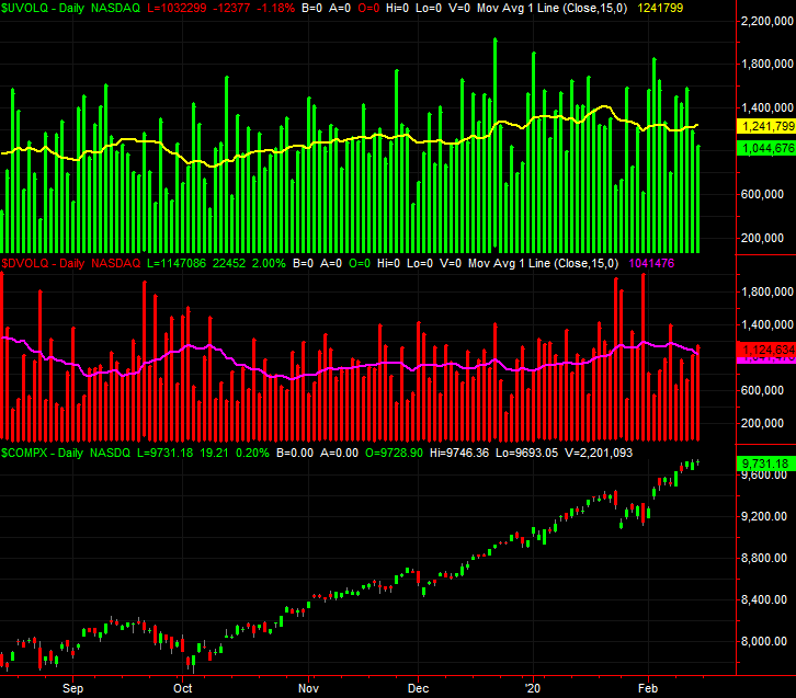
Source: TradeStation
Perhaps more concerning is how more and more stocks are dropping out of the marketwide advance, even as the index continues to climb. The number of the S&P 500’s stocks that are now above their 50-day moving average line now stands at 65.5% (green), and has actually pulled back a bit from just a couple days prior. It’s nowhere near the number of S&P 500 names above their 50-day lines from just mid-January, above 80%. It’s unusual, because the S&P 500 itself is now 3.8% above its 50-day average. That’s a little less than the 4.5% divergence from mid-January, but not so much that so fewer stocks should be below their 50-day moving averages. It’s a concern just because it indicates the rally is being driven by fewer and fewer names, meaning a smaller number have to do more of the heavy lifting.
S&P 500 Stocks Above 50, 200 Day Moving Average Lines vs. S&P 500
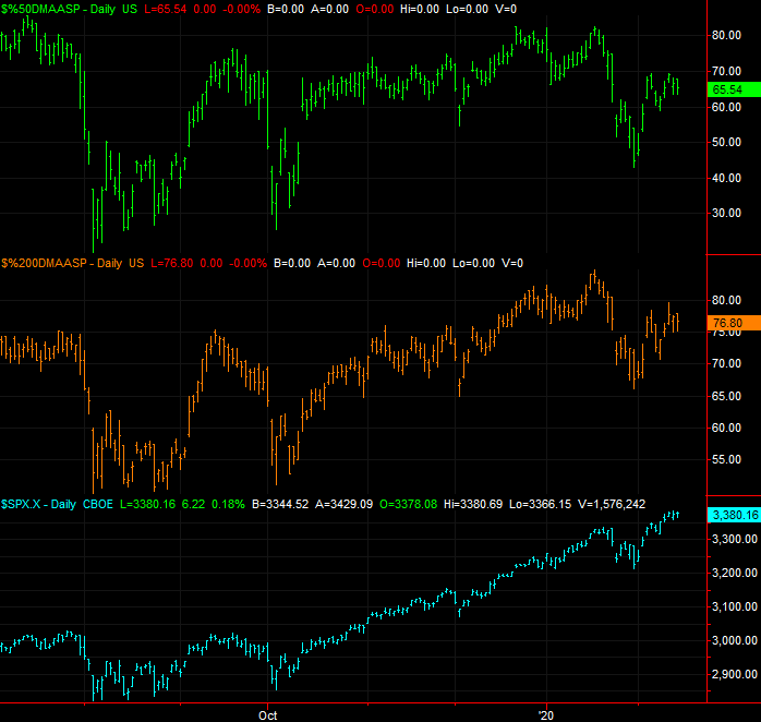
Source: TradeStation
The same analysis of the number of S&P 500 constituents above their 200-day line reveals even more trouble. The index is now 11.46% above its 200-day moving average, versus 11.2% as of mid-January. But, only 77% of those tickers are now above their 200-day lines, versus 84% a month ago. Again, it says more and more names are not participating in the advance.
The same goes for the NASDAQ Composite and its stocks, though seemingly more so. Only a little more than half of the NASDAQ’s names are above their 50-day moving average lines, and only 60% are above their 200-day lines even though the NASDAQ Composite itself hasn’t been as far above either of those moving average lines in years as they are right now.
NASDAQ Stocks Above 50, 200 Day Moving Average Lines vs. NASDAQ
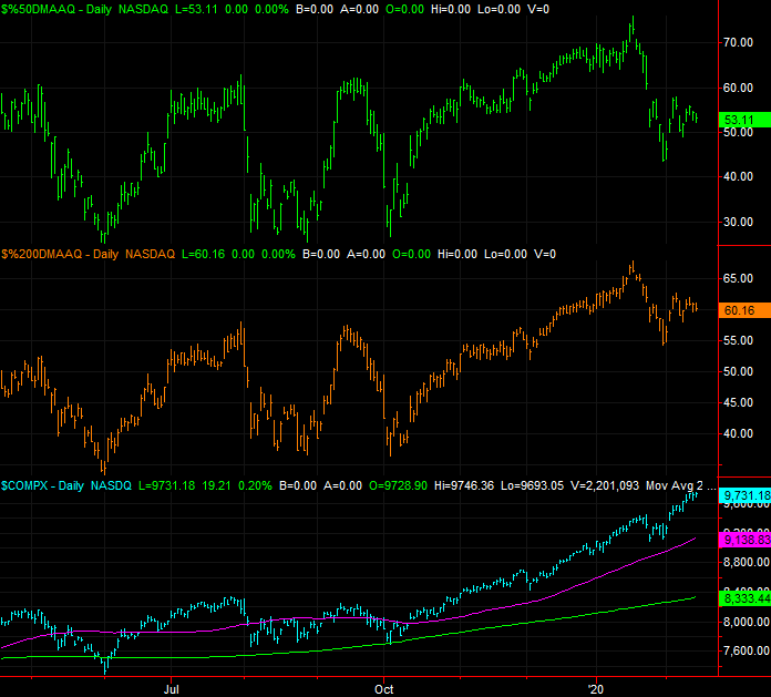
Source: TradeStation
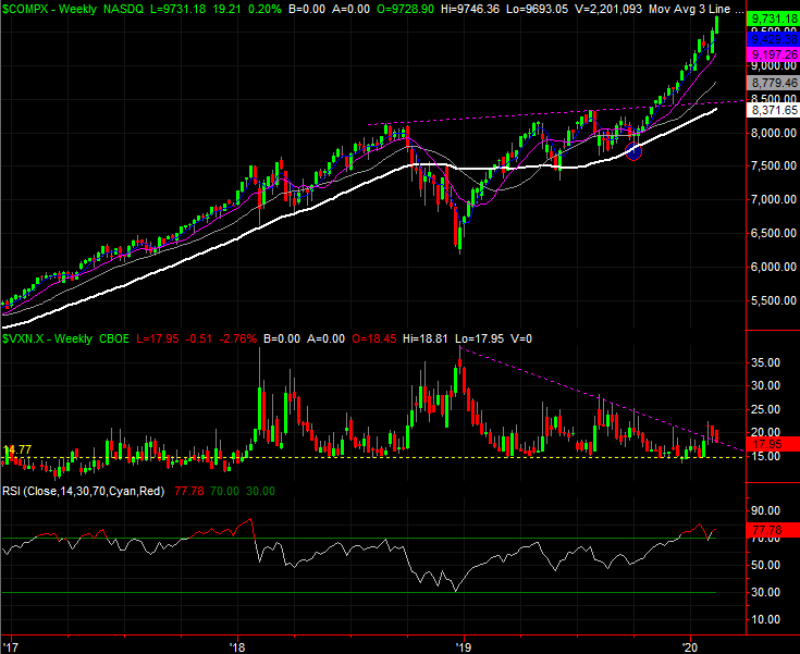
And just for kicks, a weekly view of the NASDAQ Composite. Notice in this timeframe just how far above the 200-day moving average line the index is now. That’s a 16.8% divergence.
NASDAQ Composite Weekly Chart, with VXN and Volume
Source: TradeStation
The challenge remains the same as it has for months… few argue the market is overbought and ripe for a pretty big correction. Until they’re willing to look down and see how overextended stocks are though — and until the bears are willing to plow in for more than just a couple of weeks — that prospect is nothing more than a prospect. We have to side with the present momentum, and we even have to let the indices fall under their 50-day moving average lines (rather than just to them) before we can entertain the worst-case scenario.