Weekly Market Outlook – With a Bottom in Sight, Friday Ruined Everything
Weekly Market Outlook – March 22nd, 2020
Just a preface: All bets are off. There’s nothing about the market’s or the charts’ recent history that means anything right now. That’s not a permanent condition. As insurmountable as the fallout from the COVID-2019 outbreak seems right now, capitalism finds a way. For better or worse, greed works. We’ll find a bottom. The only questions are, when and where? That’s when charts will start to matter again, and the market will have to pick up wherever it leaves off.
It’s point to make at this time — headed into Monday — because futures are down again…. big-time. Another circuit breaker is apt to kick in today.
Still, let’s look at where we are, on the chance things start to drift back to normal this week.
Take a look at the daily chart. We were seeing hints of a bottom in the middle of the week, as evidenced by opens and closes near the highs for those days, and well off the lows. The bulls were testing the waters. Then Friday. Stocks got slammed to close at the lowest close since early 2017. There’s no previous low now acting as a support line in sight.
S&P 500 Daily Chart, with VIX and Volume
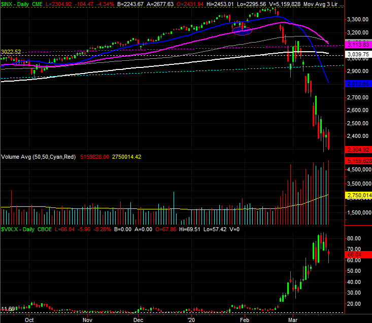
Source: TradeStation
Now take a closer look at the lower portions of the daily chart. For the market to be hitting multi-month lows, volume wasn’t all that wild. It was above average, but not crazy… particularly given that it was an expiration Friday. Also notice the VIX, or fear gauge, was coming down off its recent multi-year highs.
Maybe it’s nothing. Or, maybe it’s a hint that the worst-case scenario is truly priced in (or close to it).
Something else along those lines…
It doesn’t apply to the S&P 500 or the NASDAQ Composite, but you’ve likely heard by now the Dow Jones Industrial Average has dished out a so-called death cross, where the 50-day moving average line (purple) falls under the 200-day moving average line (white).
Dow Jones Industrial Average Mini-Futures Chart
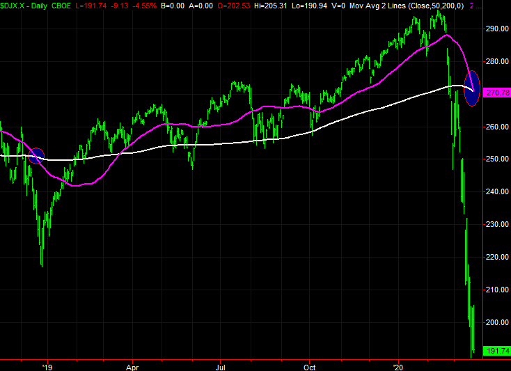
Source: TradeStation
It’s supposed to portend more weakness, suggesting the momentum has turned fully bearish in multiple timeframes. It’s a somewhat flawed idea though, for a couple of reasons.
Chief among those problems is, we also so a death cross back on December 19th of 2018. The big low literally took shape five days later, December 24th, when investors realized they overshot. We saw another one in mid-January of 2016…. on the same day as the major bottom. The one before that was August 11th of 2015. Stocks hit a scary low on the 24th, before a 15% rebound that took less than two months. The ones from mid-2011 and mid-2010 were also incredible buying opportunities.
Could this time be different? Sure. We also saw a death cross for the Dow at the beginning of 2008, and stocks took a beating for the rest of that year. We’re just saying, from an odds-making perspective, a death cross is far more often buying opportunity than a selling one. This implosion would have to turn into a recession for this one to be like the 2008 instance and different than the five that happened between then and now.
As for the NASDAQ, same story. That is, a rout, but a rout that’s been so harsh it’s become almost unrealistic… and difficult to believe will last. Also notice the selling volume behind the NASDAQ’s decline has been above average, but not decidedly devastating.
NASDAQ Composite Daily Chart, with VXN and Volume
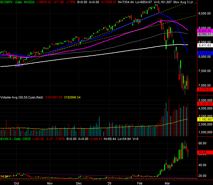
Source: TradeStation
The most noteworthy development for the NASDAQ, however, is evident on a zoomed out — way out — weekly chart. It’s from a distance we can see it’s not yet fallen all the way back to its 38.2% Fibonacci retracement level at 6528.50. It’s close, but not quite there yet. Also notice the support line plotted in light blue, and dashed, that extends back to the 2009 and the beginning of the bull market has yet to be visited. It’s rising pretty fast though, and may be what’s needed to finally bring an end to the meltdown.
NASDAQ Composite Weekly Chart, with VXN
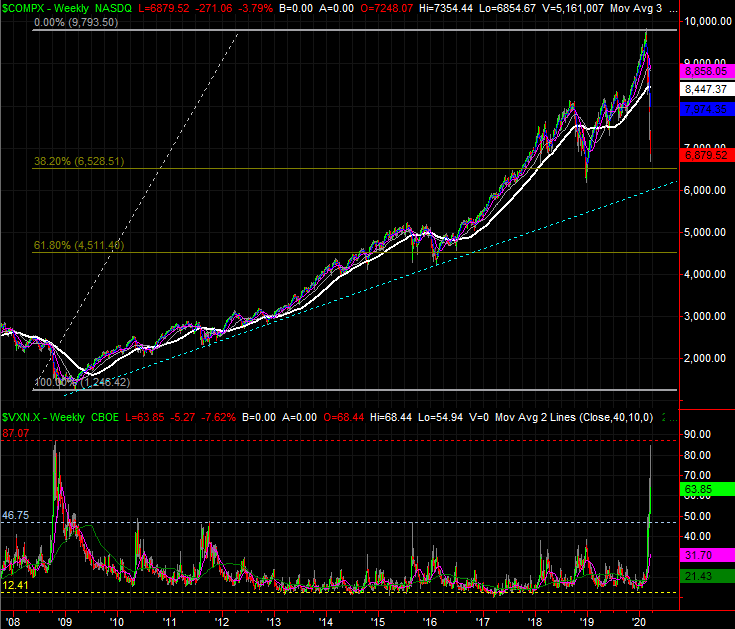
Source: TradeStation
Those two prospects aren’t necessarily in conflict. Making a bottom may be more of a process than a single even that results in a “V” shaped chart. The market could bounce around and just drift sideways for a while, giving the bull market’s rising floor a chance to catch up and spur a well-grounded recovery rally.
Either way, notice the VXN has essentially reached the peak that signaled the bottom back in 2009 (red, dashed). That’s another bullish argument, as long as worse COVID-19 news doesn’t take shape in the near future.